2026 Chicago Auto Show
Experiential Branding & Spatial Design
I. Chi-Town Alley
I had the honor of leading the environmental graphics and spatial branding to define the visual identity for Chi-Town Alley, a new platform dedicated to the city's homegrown car community at the 2026 Chicago Auto Show.
-
🎯 The Challenge
The Chicago Auto Show needed to convert a legacy commercial layout into a dynamic, community-first event space. Starting with nothing more than an existing logo and a high-level goal for the zone, my challenge was to build out a complete, authentic visual identity system. This environmental branding had to scale across massive three-dimensional architectural structures while remaining versatile enough to frame interactive zones, retail booths, and vehicle displays without causing visual clutter.
-
👤 My Role
Lead Experiential Graphic Designer / Art Director
Conceptual Art Direction, Spatial Visualization, End-to-End Asset Production, Creative & Production Alignment
-
⚙️ My Process
- Concept Development: Developed the initial concepts for the main entry towers to establish the foundational look and feel of the space.
- Collaboration & Alignment with Leadership: When project leadership introduced new brand constraints requiring a shift away from the initial color palette, I quickly pivoted the design. I adapted the environmental graphics to align perfectly with their updated standards without losing the high-energy aesthetic of the space.
- Agile Adaptation: As the environment took shape, the strength of the initial design inspired leadership to expand the scope and invest in a massive overhead ring as a centerpiece for the exhibit. Tasked with this late structural addition, I researched the physical medium and built high-fidelity mockups, using advanced photo-compositing to simulate the graphics within the physical space. I successfully secured executive sign-off on the ring and delivered final, press-ready files — all within a seamless 7-day sprint.
- Scalable Asset Production: With the branding and structural elements fully approved, I managed a comprehensive production workflow, scaling the visual identity down to informational meterboards and promotional touchpoints.
-
📈 The Outcome
Thanks to the early alignment we built, the final designs earned immediate sign-off from project leadership and the executive production team. The resulting space generated strong organic visibility across social media as attendees and enthusiasts documented the exhibit. Ultimately, because the production team was thrilled with the seamless workflow and final execution, I was asked back to lead an expansion of the spatial branding for the upcoming 2027 show cycle.
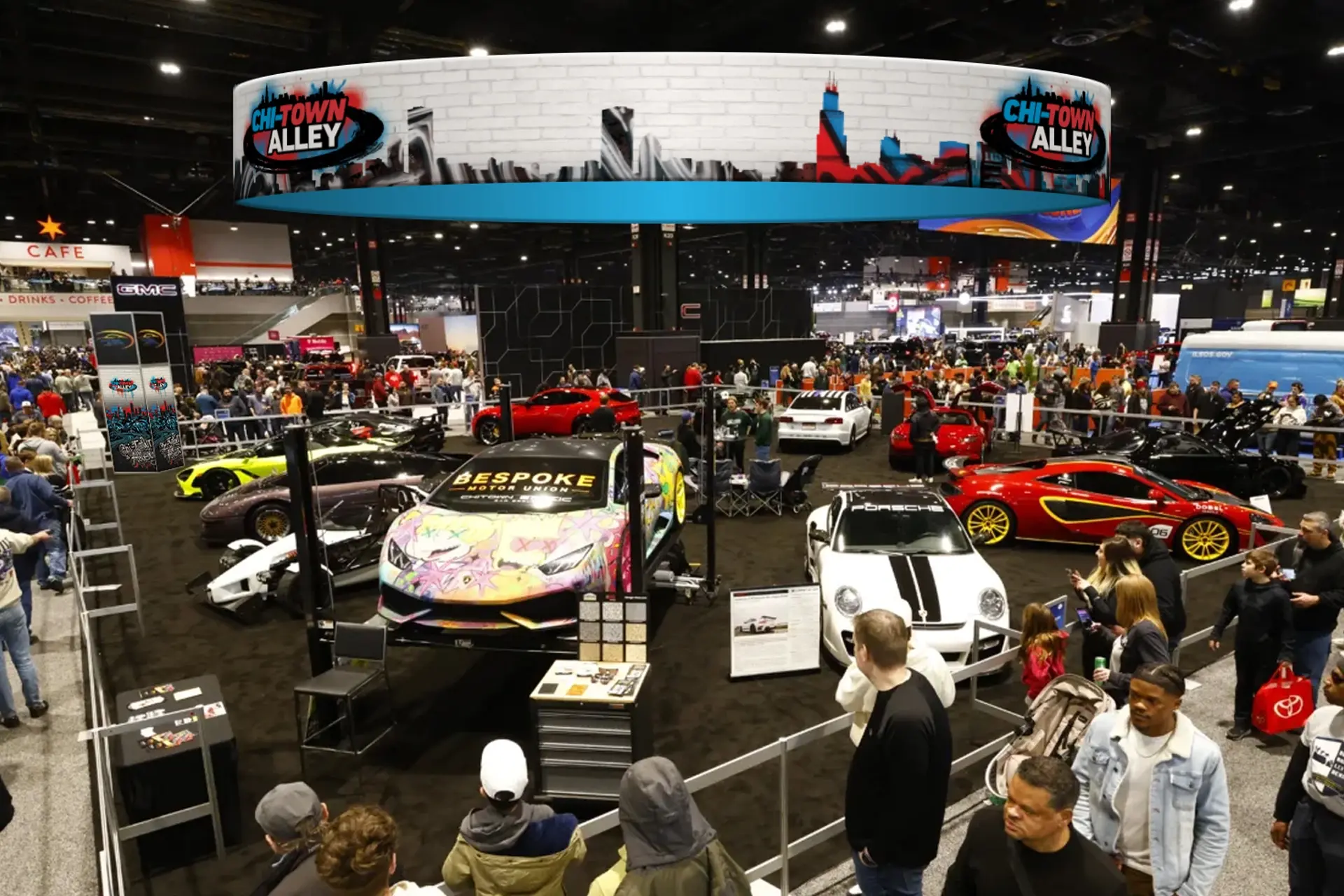
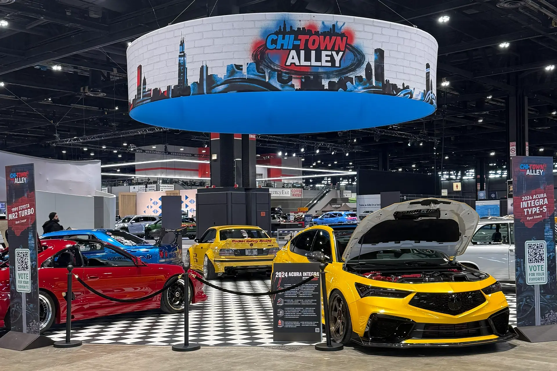
From Concept to Execution: Initial spatial rendering used to secure executive alignment (left)(top), alongside the final environmental artwork adapted to the locked fabrication specifications on the show floor (right)(above).
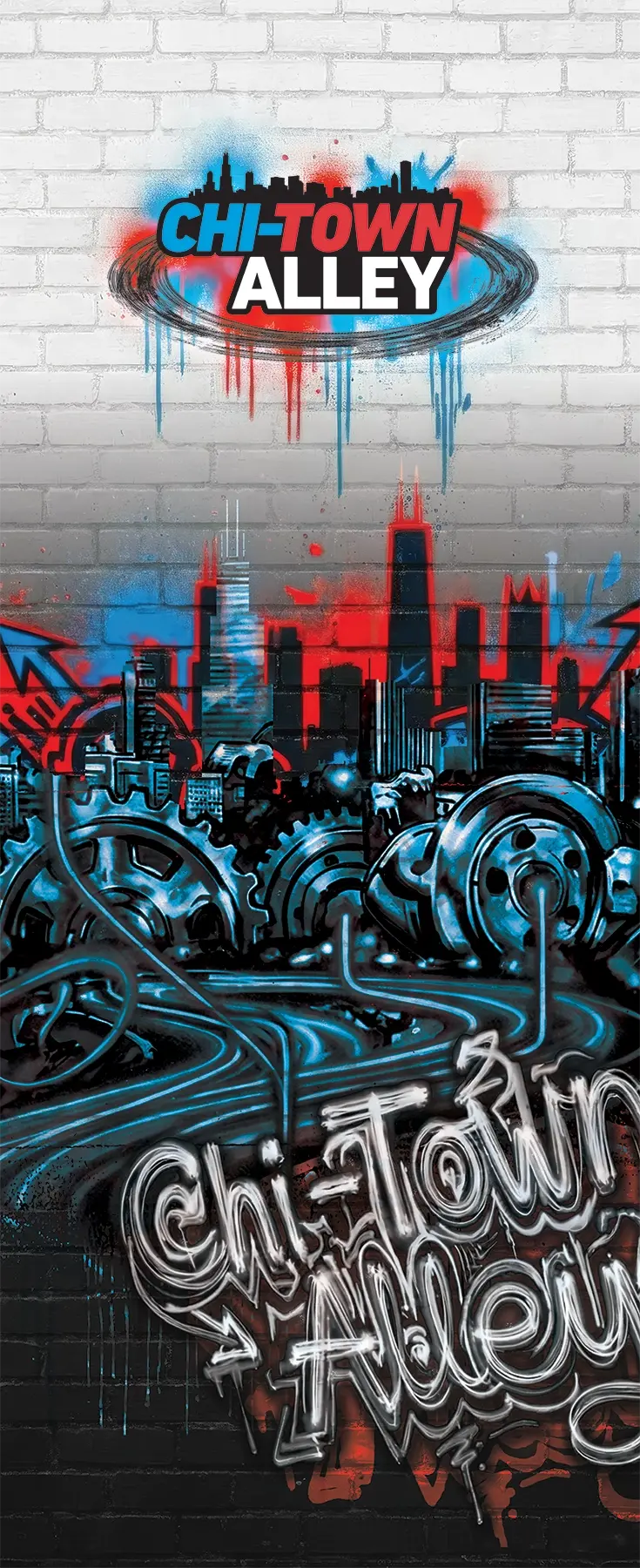
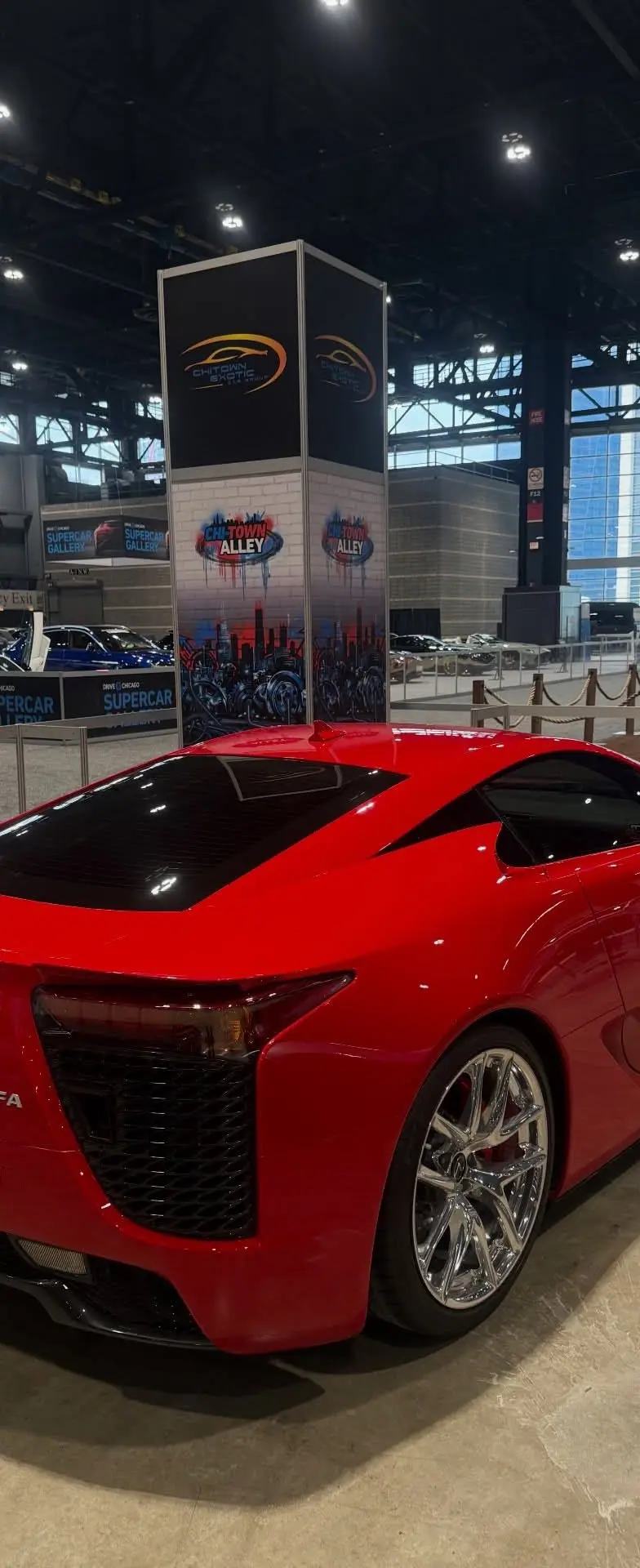
Structural Wayfinding & Branding: Custom artwork utilizing industrial and street-art motifs (left), applied to four-sided fabricated towers that anchored the zone's aesthetic and framed rotating Car Club IDs (right).
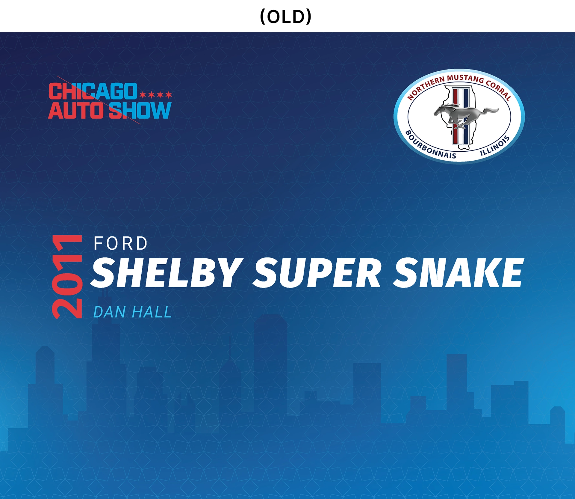

Strategic redesign of the legacy vehicle placards (left)(top), transitioning from the general-use 2025 Chicago Auto Show template to create a fully immersive, zone-specific co-branding system for participating car clubs (right)(above).
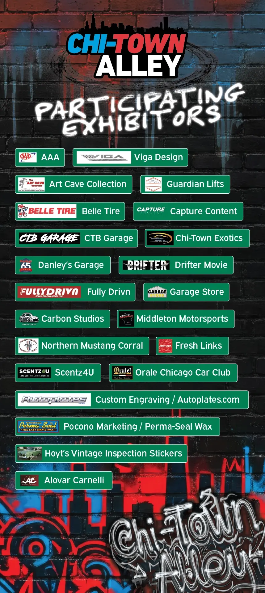
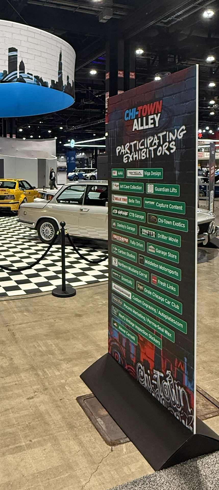
Stakeholder Integration: Developed a standardized, UI-inspired container system to harmonize disparate sponsor and exhibitor logos, maintaining environmental brand integrity without sacrificing legibility.
II. Overlanding Chicago
Transforming standard event collateral into authentic brand touchpoints
For the Overlanding Chicago footprint, my initial brief was simply to update standard informational elements like the vehicle placards and the participating exhibitor list. Recognizing an opportunity to elevate the space, I pitched a reimagined concept that transformed these basic templates into highly themed physical artifacts. Utilitarian information cards and traditional sponsor directories were rebuilt as immersive environmental touchpoints incorporating weathered typography, corkboard aesthetics, and authentic trailhead maps. By treating every operational requirement as an opportunity for world-building, I helped delivered a space that perfectly captured the rugged personality of the off-road community.
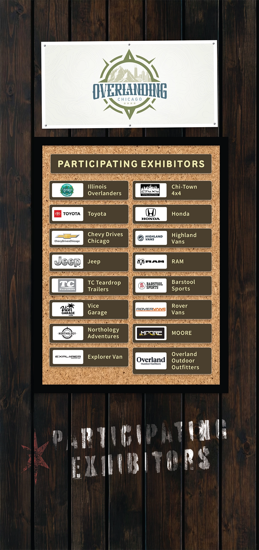
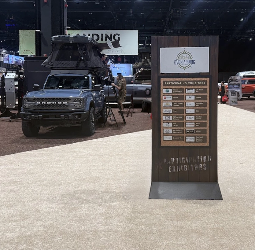
Exhibitor Directory
The initial brief for the Overlanding Chicago sponsor directory was a simple request to list partner names and logos on a rustic, campground-style sign. Recognizing an opportunity to elevate the physical space, I bypassed a standard flat layout and engineered a high-fidelity, photorealistic environmental asset. By incorporating distressed wood textures, stenciled typography, and a structured corkboard aesthetic, I transformed a standard sponsor list into an authentic, rugged park directory. This proactive design approach exceeded the original scope, with project leadership noting the final artwork was ”unexpected and way better than the direction given.“
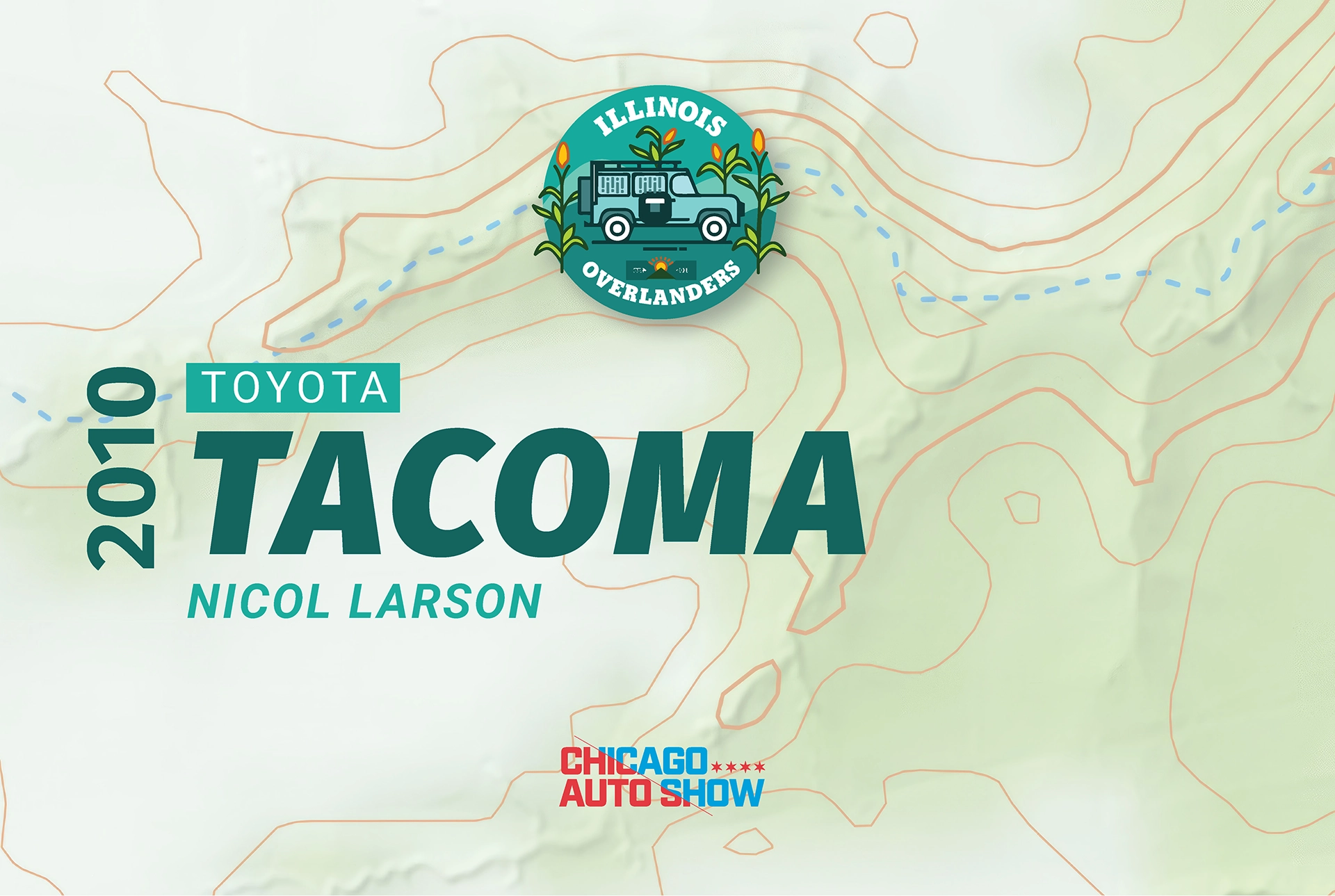
Old
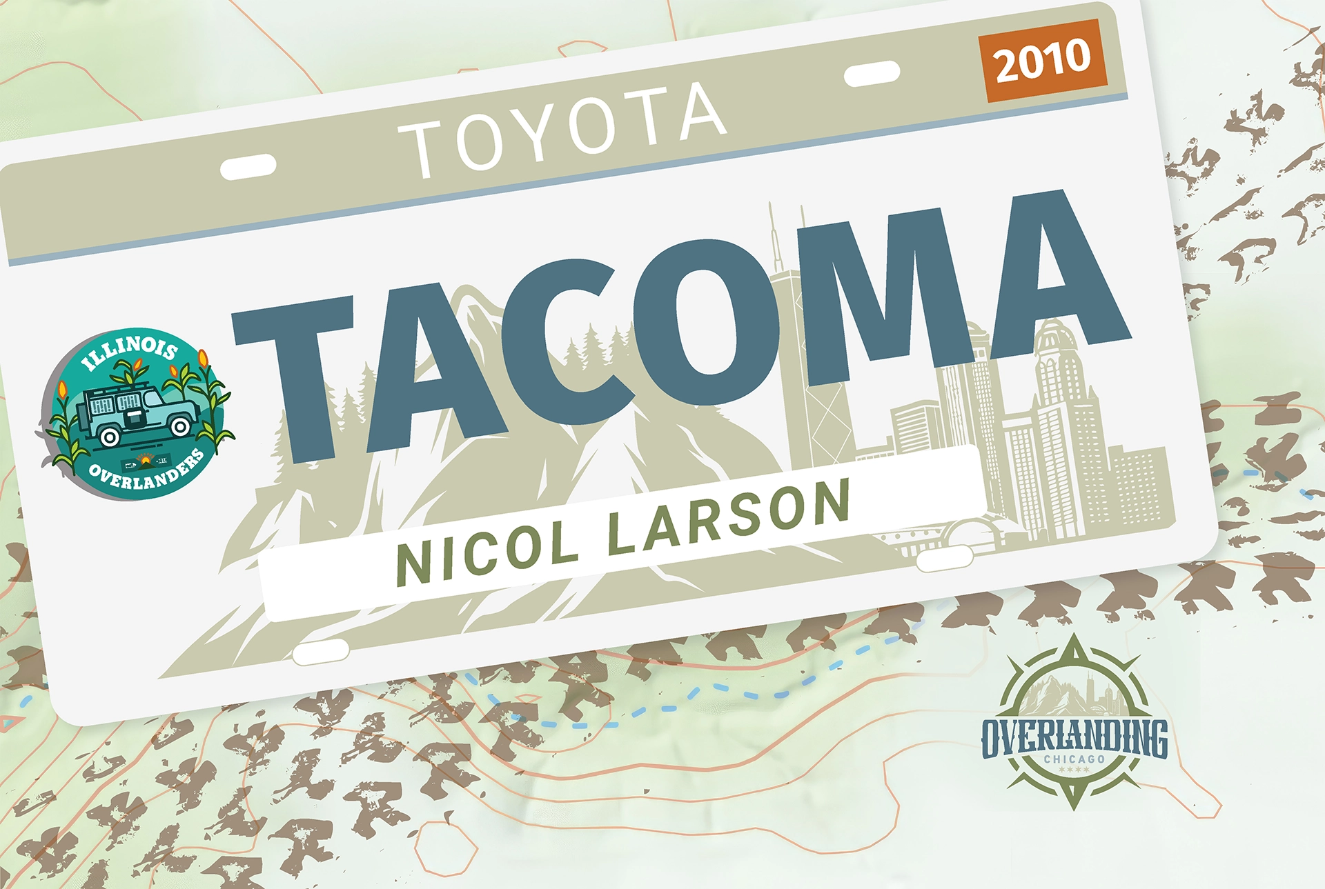
New
Illinois Overlanders Exhibiting Vehicle Placard
Assigned to simply update the vehicle placards text for the 2026 show, I saw an opportunity to pitch a more engaging concept. The original design got the basic information across, but was only mildly tied in to the theme of the Overlanding Chicago zone. I redesigned the standard information card to mimic a personalized license plate, tying the required vehicle specs directly into the automotive theme. I sent the options up the chain, and the CAS stakeholders loved the fresh direction, earning the design immediate approval for the show floor.
III. Supercar Gallery
Navigating high-profile stakeholders with premium touchpoints and strategic design
For the Drive Chicago Supercar Gallery, the primary challenge was managing a notoriously discerning group of participating luxury dealers who were dissatisfied with the previous year's collateral. To navigate their expectations and foster a sense of ownership, I strategically presented six unique typographic directions for the vehicle placards. Giving them a voice in the process accelerated the approval timeline, resulting in a clean sign-off on a highly elegant, premium design that we paired with upgraded physical stands. The project also required rapid, agile execution; when a major dealer unexpectedly pulled out just before the show, I seamlessly executed last-minute revisions to the primary directory signage to ensure the gallery's presentation remained flawless.
IV. Experiential Touchpoints
Scaling the visual identity across partnerships and interactive activations
Maintaining total visual immersion requires extending the core aesthetic into every corner of the event space, including sponsor partnerships and interactive zones. For the Chi-Town Alley footprint, I led the co-branding integration for "Fun Times Soda," seamlessly adapting their colorful, character-driven assets to fit the exhibit's gritty, street-inspired atmosphere through the use of brick texturing and graffiti-style treatments. I also developed the collateral for interactive attendee touchpoints, such as the Family Zone contest signage. By treating these distinct activations as extensions of the overarching environmental design, I ensured that partner brands and gamified giveaways felt fully integrated into the world-building rather than tacked on.
V. Looking Ahead: 2027 & Beyond
Translating aesthetic success into scalable business opportunities
Following the highly successful debut of the Chi-Town Alley space, I was tasked with concepting the architectural evolution of the environment for the 2027 show. Moving beyond surface-level graphics, I developed comprehensive structural visualizations featuring industrial garage doors, shipping container frameworks, and immersive alleyway canopies. Upon presentation to executive leadership, these concepts secured immediate alignment and are actively being utilized to strategically upsell standard event packages to individual dealers — transforming an environmental design win into a direct driver of future revenue.