Mack Trucks: Evolving a digital survey experience
A design exploration to elevate visual and interaction design
I. About the Project
-
🎨 Modern Redesign
In this project I revisit the original 2015 online survey aspect of this multichannel campaign and reimagine how it could be improved using modern user-centered design principles, UI/UX, interaction design, information architecture, contemporary visual design trends, and a stronger alignment with Mack's brand identity.
Presented below as an 'Old vs. New' comparison, this project serves as a case study demonstrating my evolution and growth as a designer and my deeper understanding of modern digital product design. It directly illustrates how I now approach similar challenges with an expanded skillset in areas like design thinking and creating more delightful, functional design systems.
-
🕰️ About the 2015 Original
While the original initiative was primarily focused on marketing goals, execution of the project involved significant underlying user experience challenges, including designing an intuitive user flow for survey completion, structuring information effectively, and ensuring a seamless experience across devices.
As the lead designer for the original survey site, my responsibilities included:
Design (UI/UX)
- Translating the printed survey into an intuitive digital experience
- Defining an online design language aligned to the campaign's print materials
Execution
- Converting mockups into a fast, seamless experience with optimized HTML/CSS
- Collaborating with the back-end team to incorporate survey functionality
Quality Assurance
- Conducting a multi-stage quality control process to ensure accuracy
- Testing user flow and device compatibility
The original campaign was highly successful, generating over 1,000 qualified leads, with a significant percentage expressing interest in learning more or test driving a truck. This success highlights the impact of effective user flow and clear information architecture in meeting business objectives, even within the context of 2015 design practices.
II. Survey Login
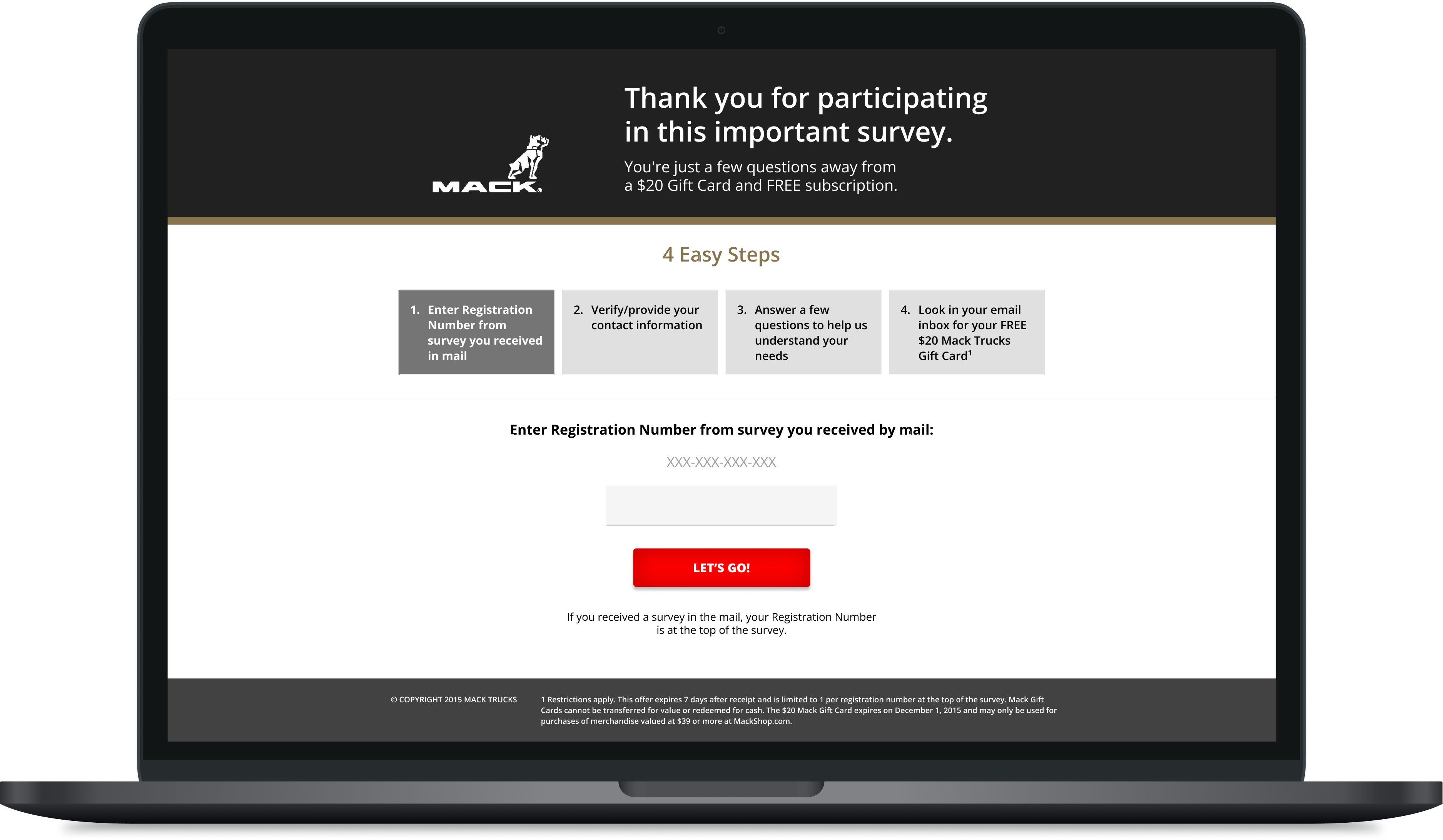
Old
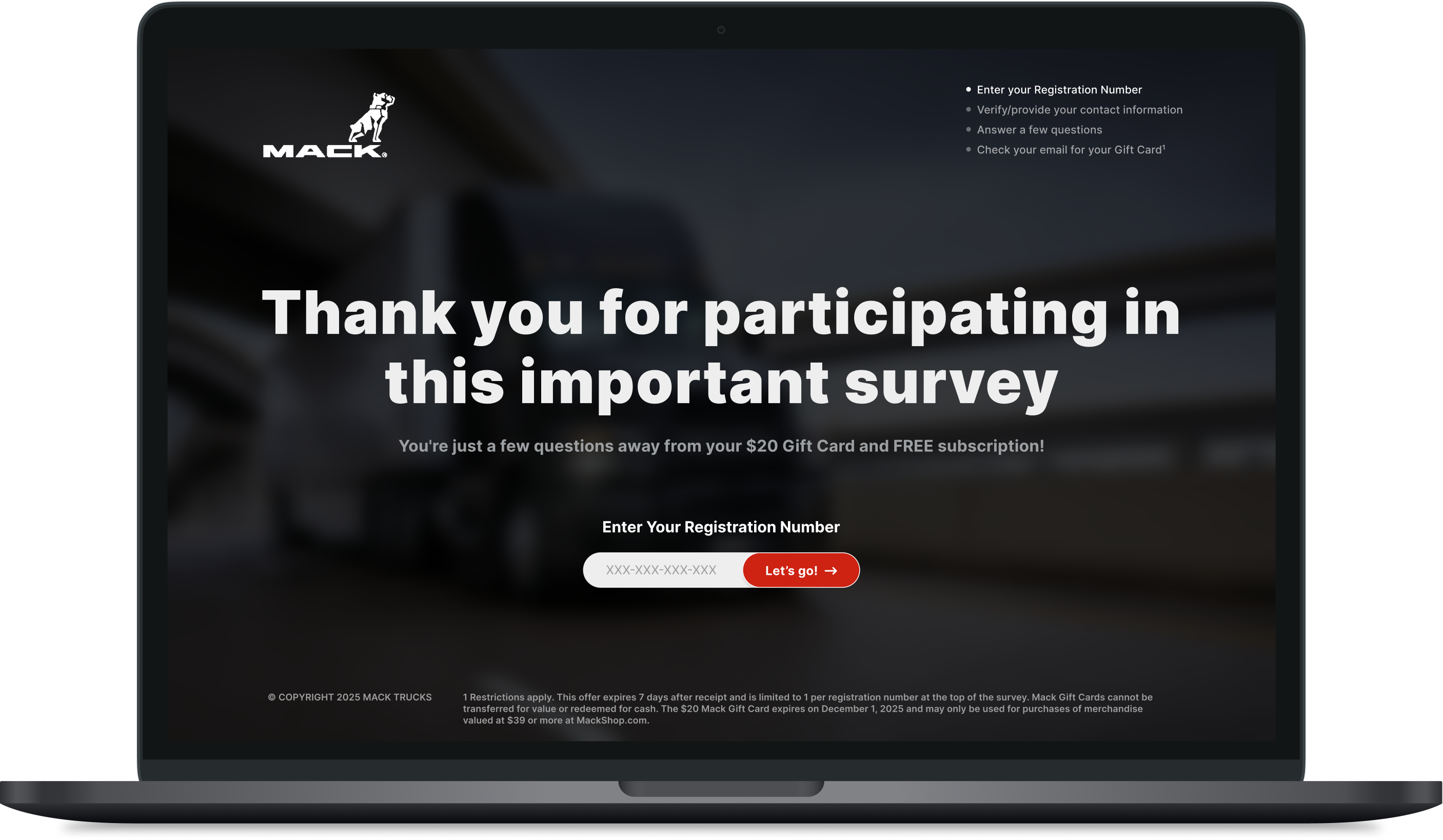
New
Streamlining the Entry Point
Revisiting this 2015 project provided the perfect sandbox to get hands-on with Figma. The legacy login screen was functional but visually heavy by today's standards. For this theoretical redesign, I stripped away the clutter, utilized a full-bleed hero image to reinforce the Mack Trucks brand, and modernized the authentication module to create a frictionless, welcoming entry point.
III. Contact Information
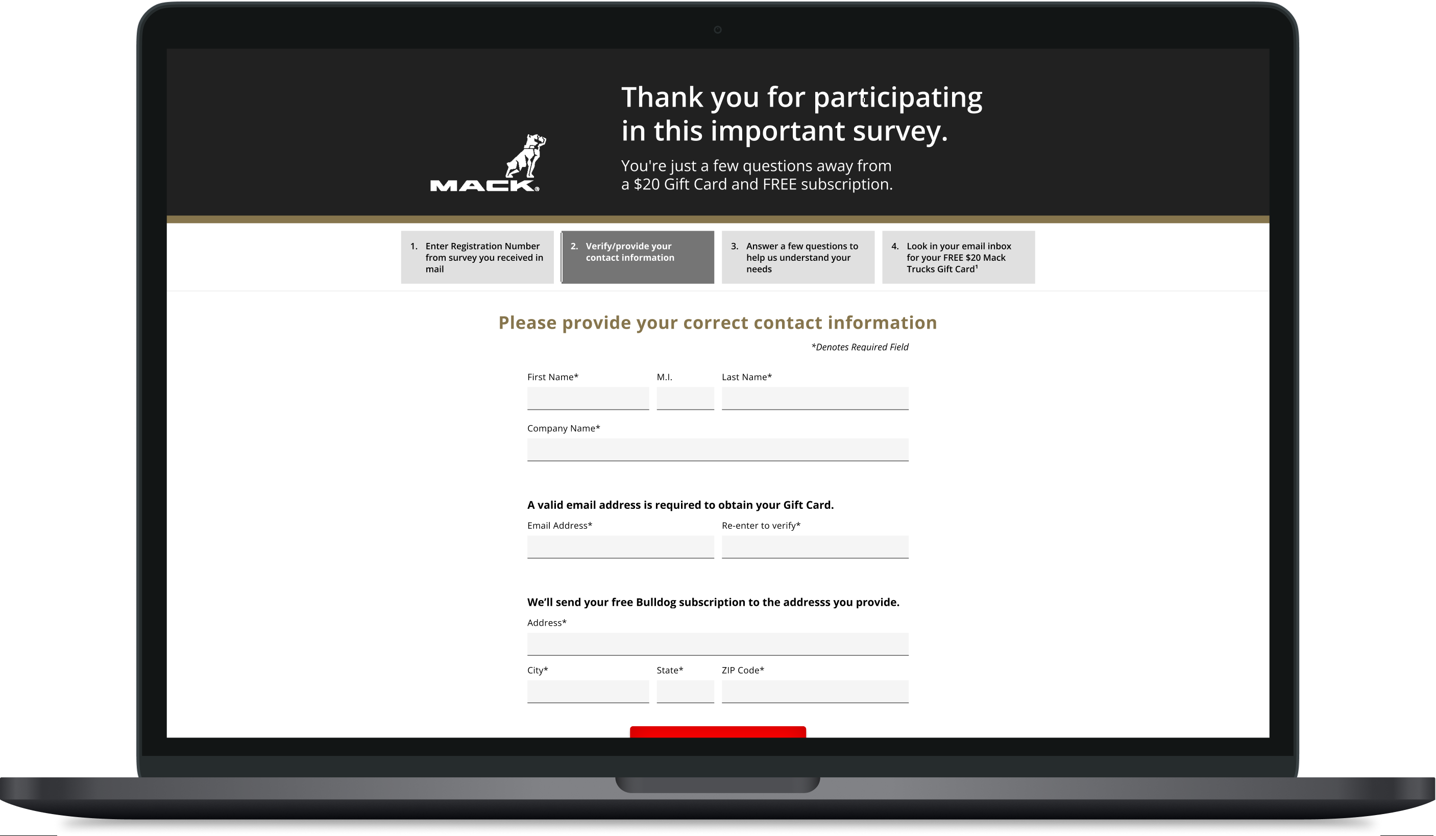
Old
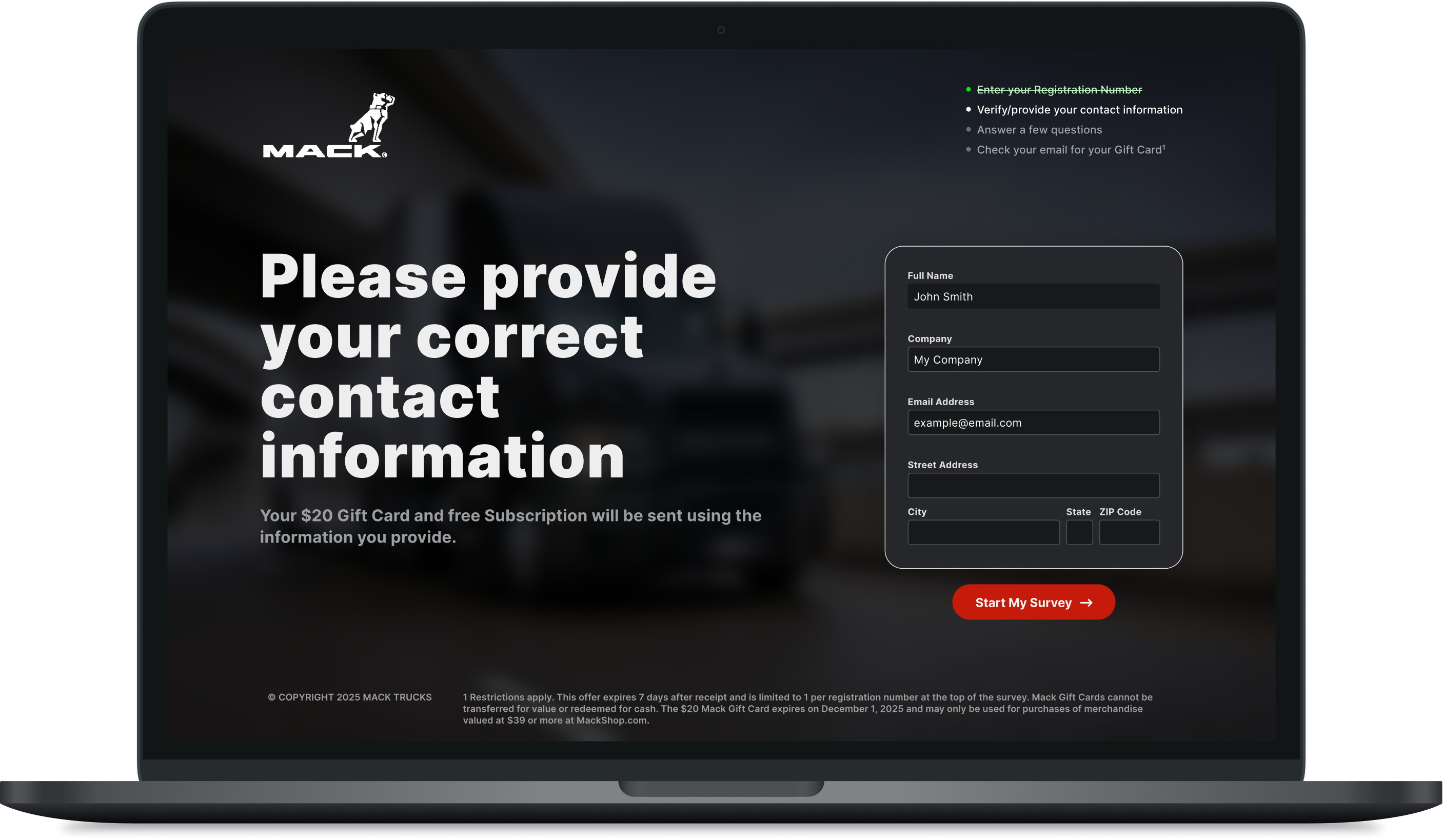
New
Reducing Friction in Form Design
Forms are notoriously high-friction areas for users. The original layout presented a dense wall of inputs that felt tedious to complete. In this conceptual update, I focused on modern UX best practices—introducing generous padding, clear typographical hierarchy, and contemporary input styling to drastically reduce cognitive load and make the data-entry process feel effortless.
IV. Survey Questions
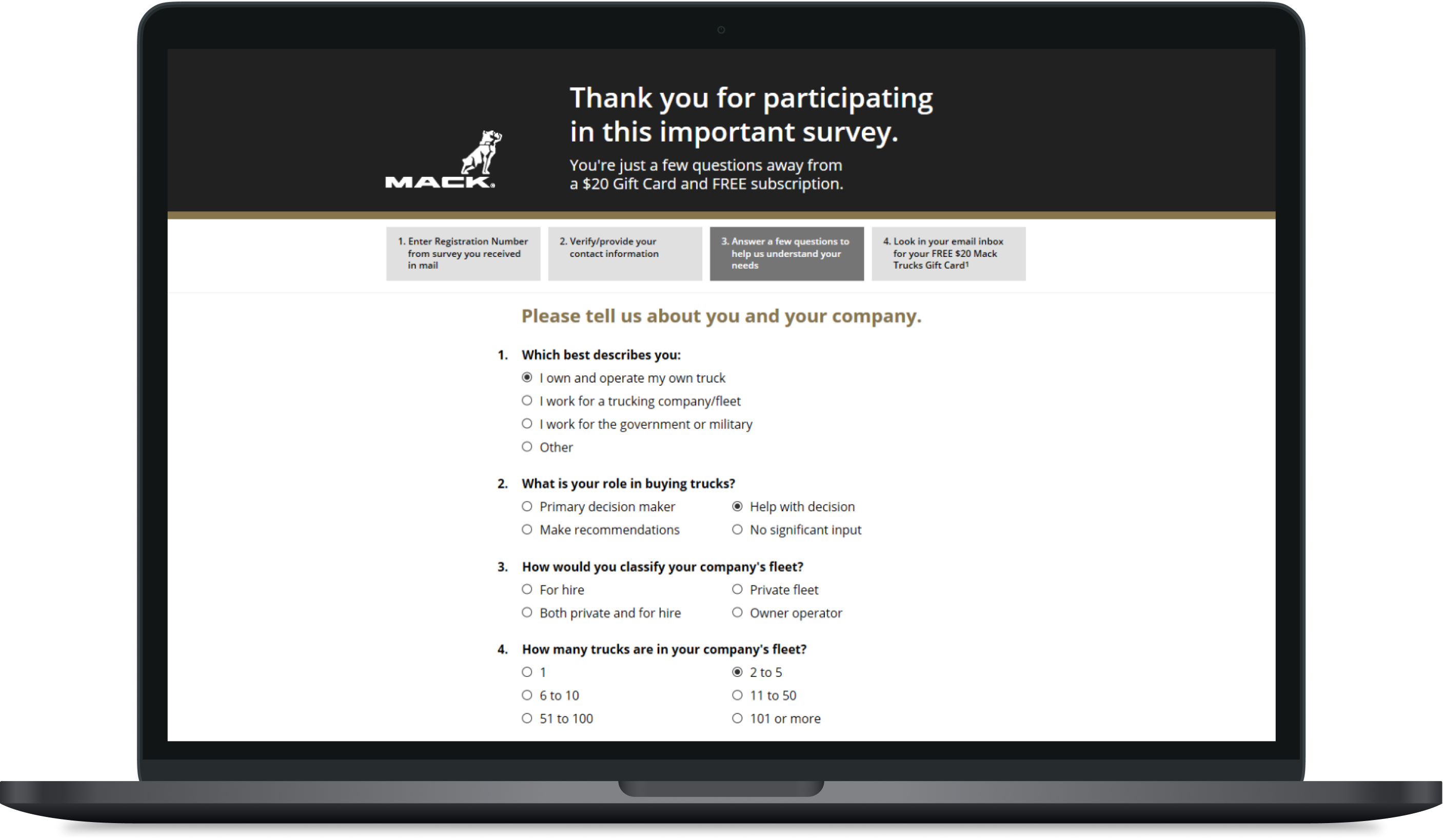
Old
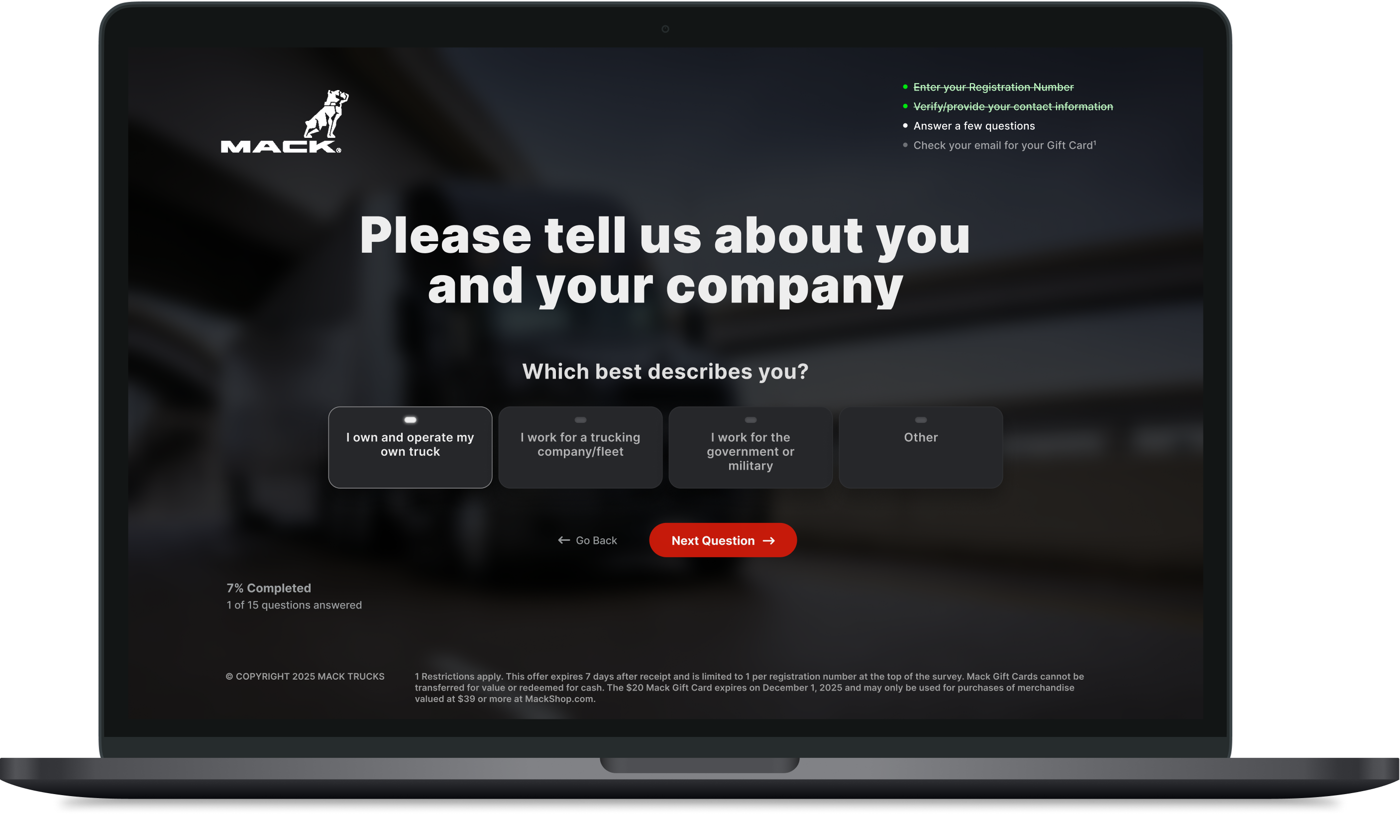
New
Modernizing Interaction Patterns
The core of the experience lies in the questions themselves. I used this section to explore Figma's component and variant features, swapping out the legacy radio-button lists for a clean, card-based interface. By enlarging tap targets and defining distinct interactive states, this redesign ensures the survey would be highly accessible and touch-friendly across all modern devices.