Strategic Design Transformations
Every transformation on this page started as a real-world business hurdle. This gallery is a peek behind the curtain at my process, showing how I take raw concepts or flawed assets, find their potential, and craft them into highly intentional, production-ready assets for the real world.
-
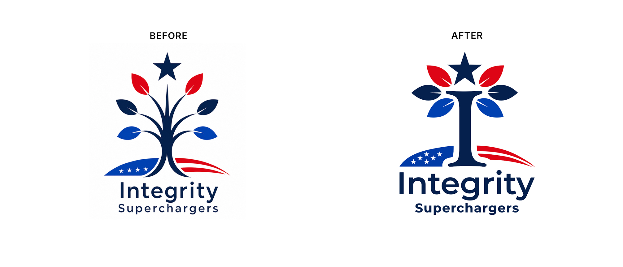
Integrity Superchargers
2026 • Commissioned Concept Exploration
About: Nonpartisan community platform empowering Americans to strengthen their lives and communities through integrity-driven action
The Refinement: Solicited to explore stronger directions for the client's original concept, I replaced a visually and metaphorically weak tree graphic with a bold "I" monogram. This new structure works on multiple strategic levels: it acts as the initial for Integrity, symbolizes individual agency, serves as a solid trunk to replace the original sagging tree, and takes the form of a classical pillar — representing integrity itself as a foundational ethical virtue. This commissioned exploration successfully established a highly stable, trustworthy visual anchor before the client paused the initiative.
-
The SAINTES
2025 • Logo refinement
About: Nonpartisan civic movement leveraging collective voting power and fact-based education to advance economic fairness and security across America
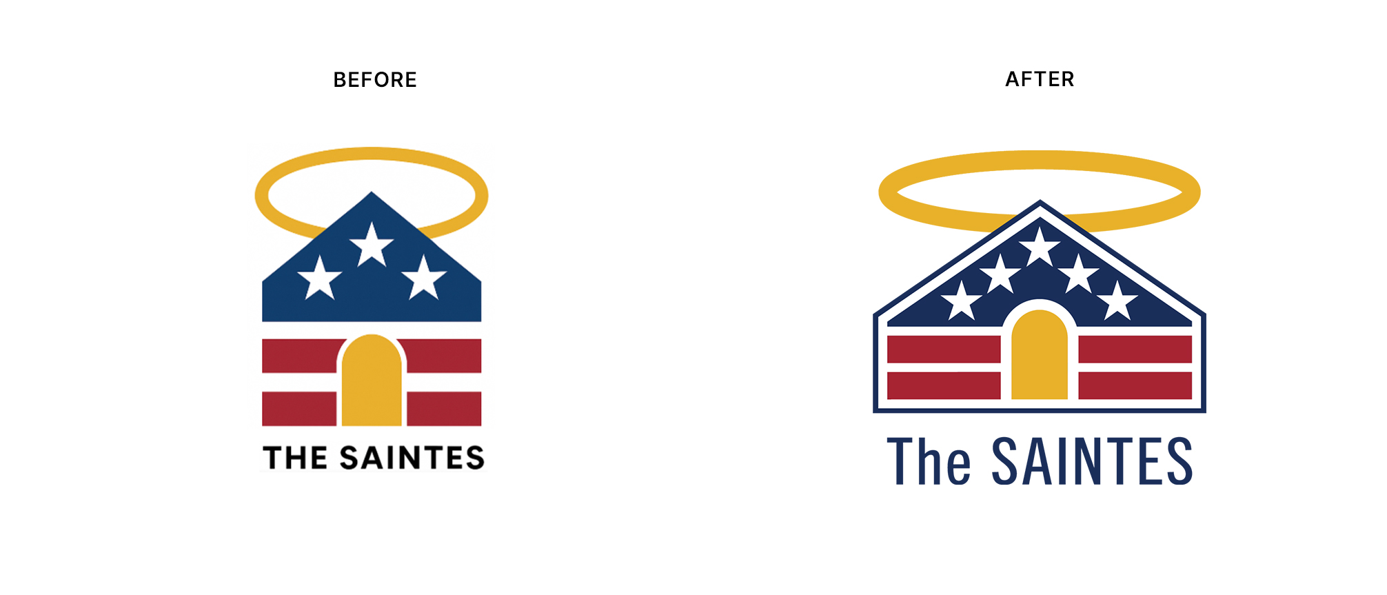
The Refinement: Balanced a raw AI-generated layout, injecting intentional institutional storytelling and precise production geometry:
Architectural Blueprint
Re-proportioned the logo to project absolute strength and stability through a wider baseline. The structural framework explicitly mirrors the historic facade proportions of the White House at the base, topped by the precise aerodynamic angles of the B-2 Spirit stealth bomber.Hidden Symbolism
Aligned the gold entrance and upper triangle to form a hidden, upward-pointing arrow for progress, anchored by a pair of red eqaul sign representing balance and equality.Manufacturing Optimization
Engineered the perimeter silhouette to scale flawlessly for a stamped lapel pin execution for lawmakers, refining the halo to add dimensional depth without breaking vector constraints.Typography
Replaced the generic, crowded lettering with a commanding, high-legibility sans-serif typeface.Saints Logo Usage Guidelines
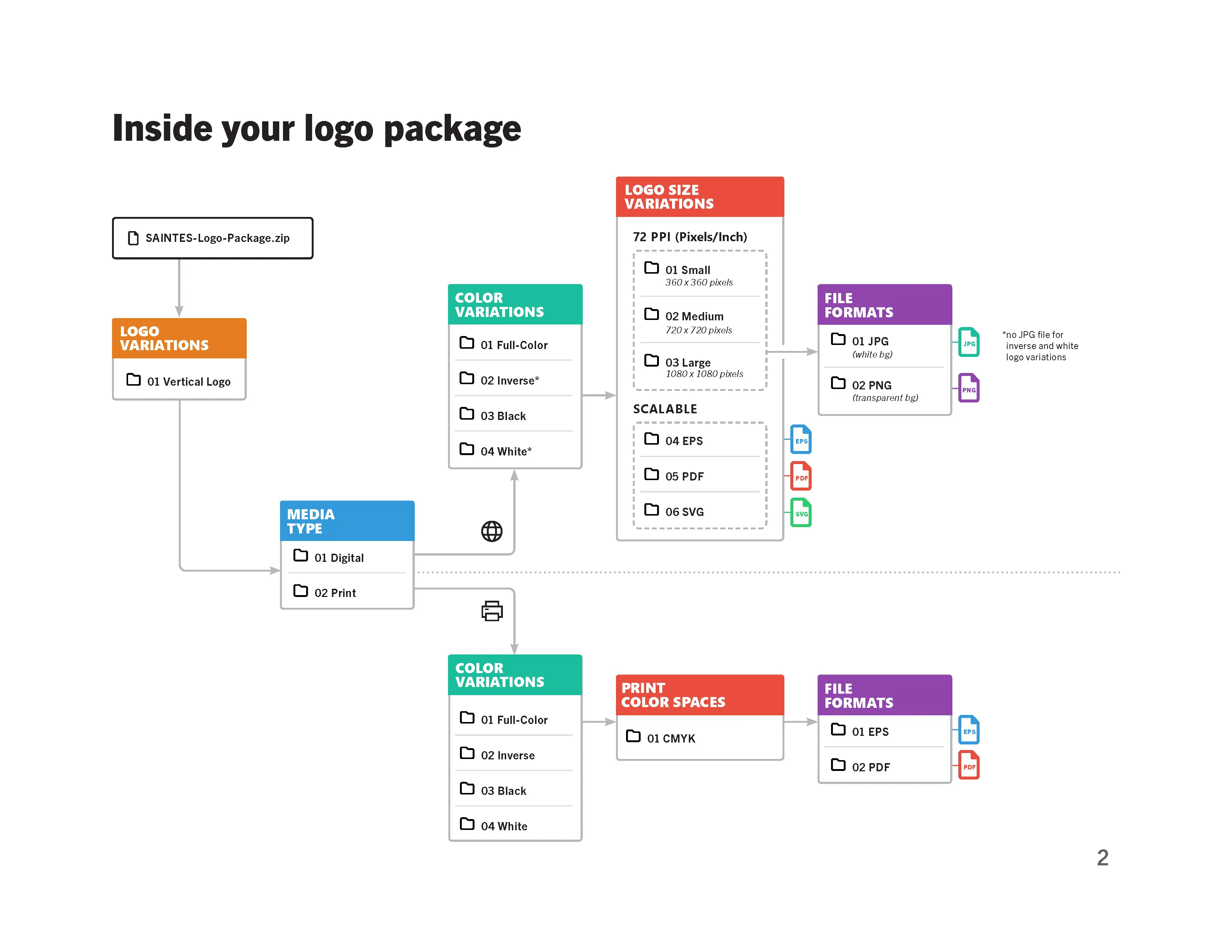
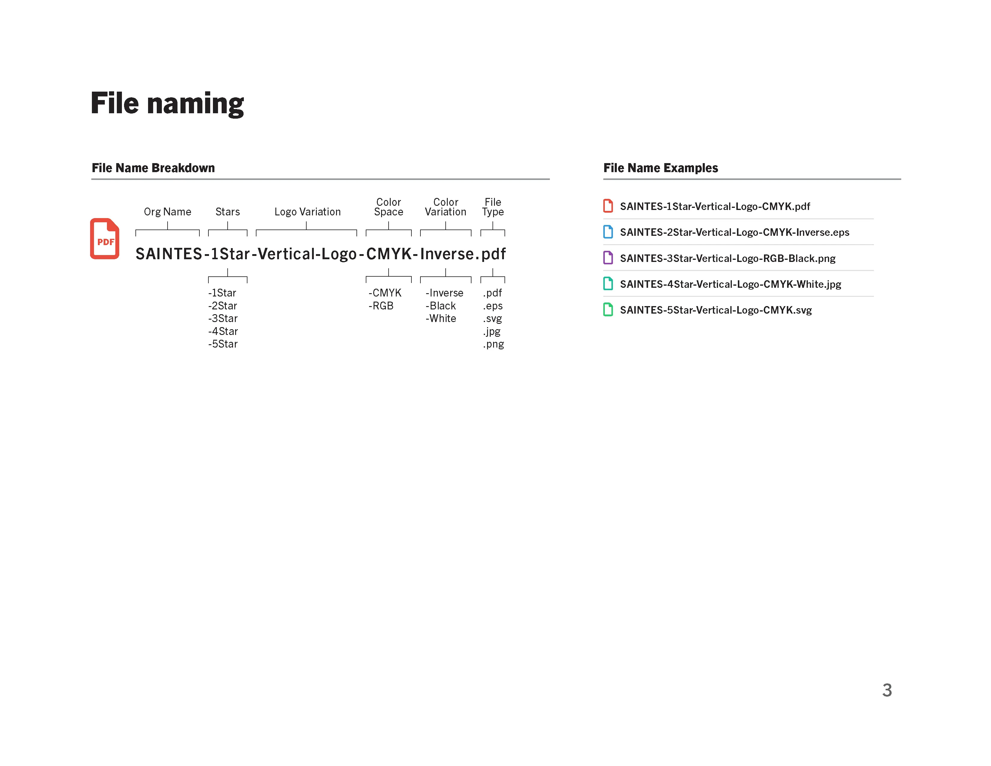
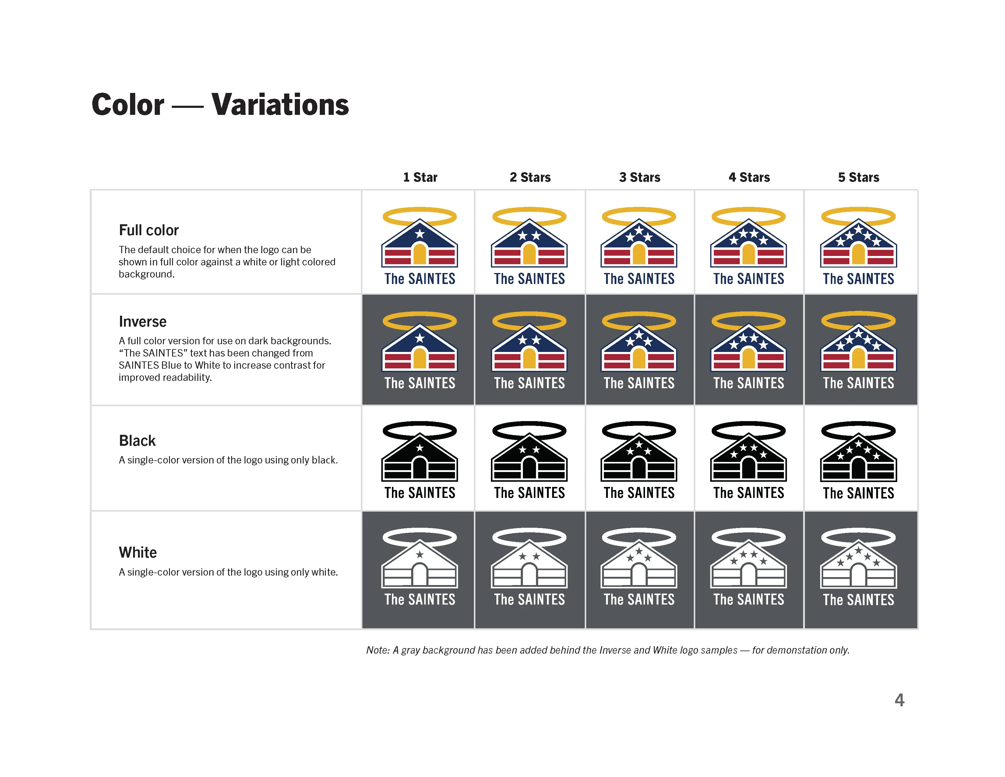
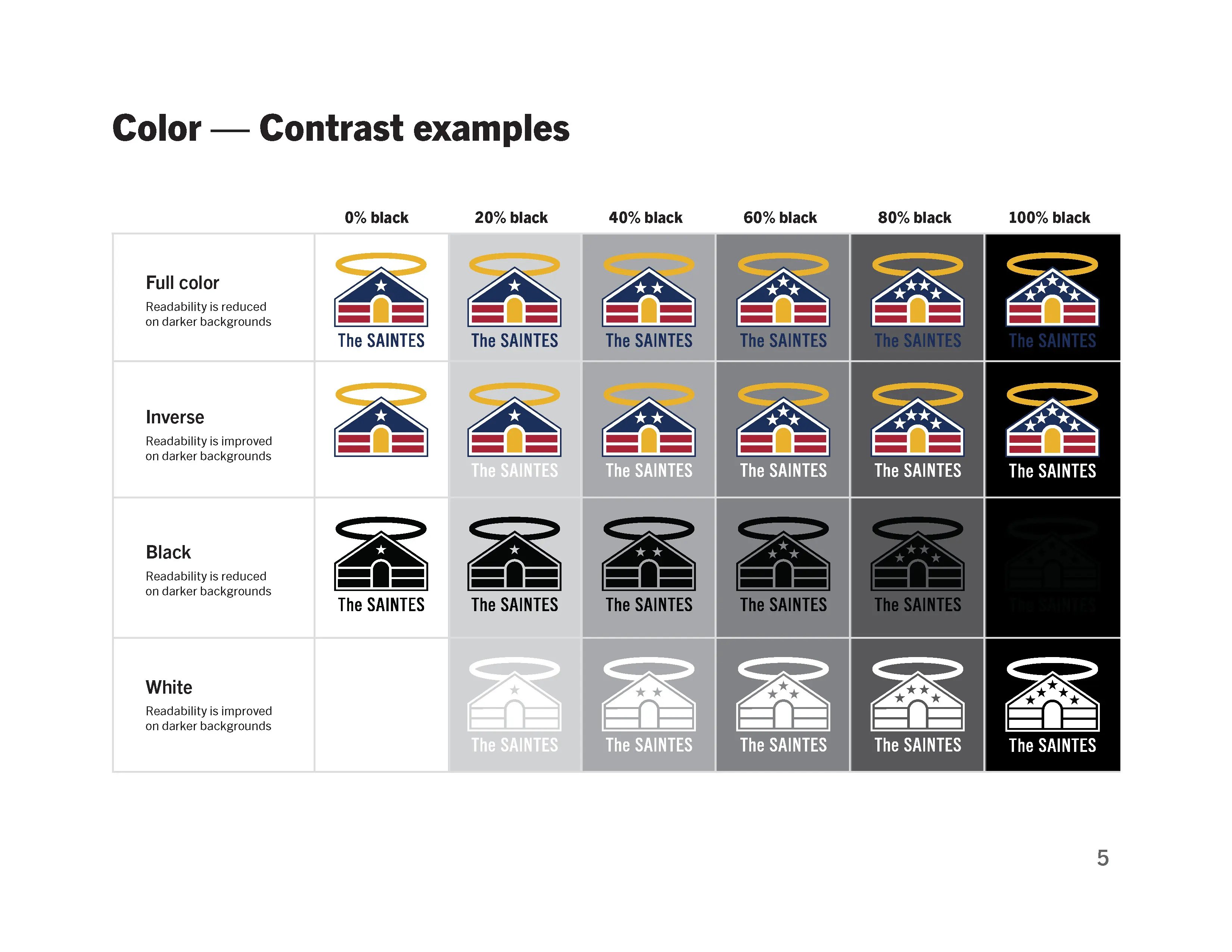
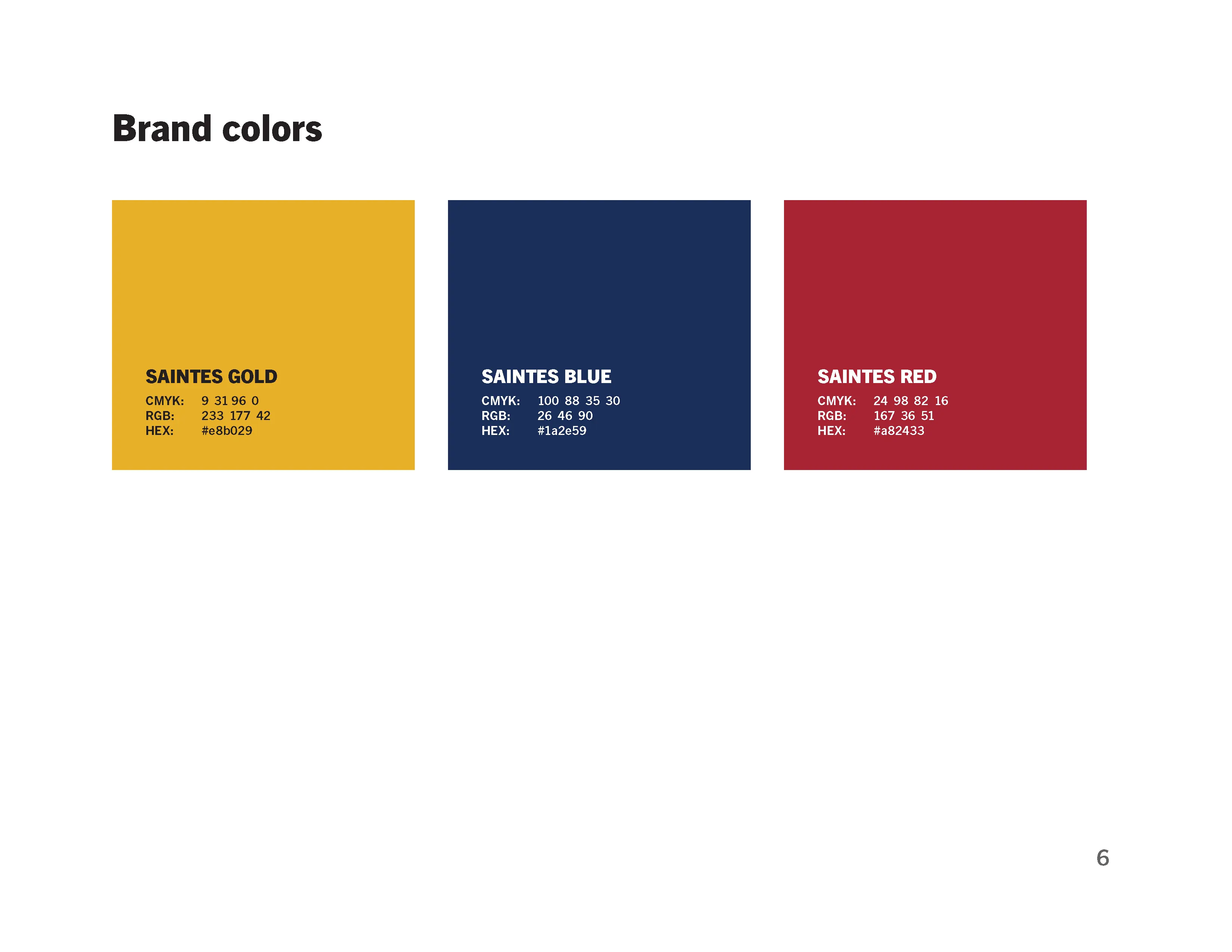
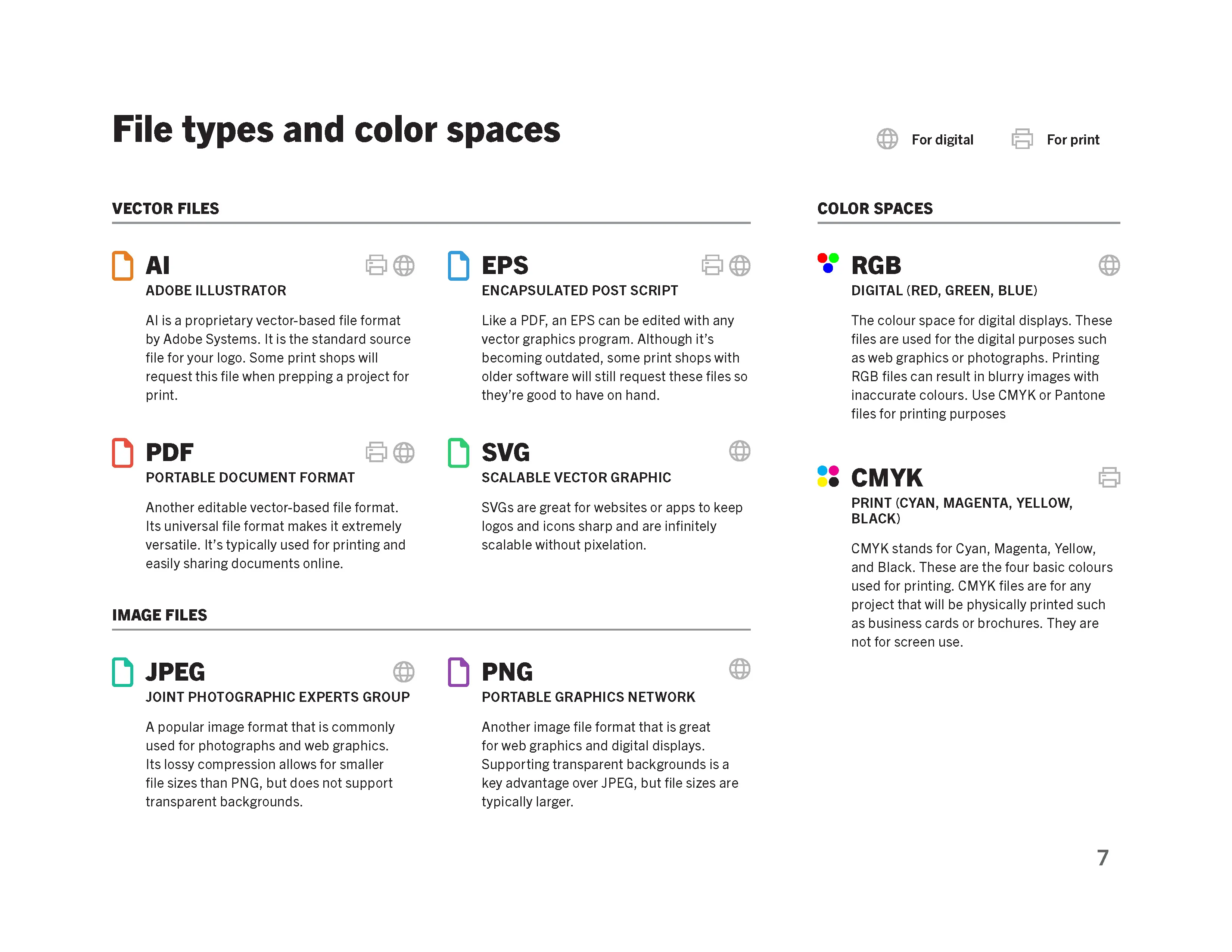
Anticipating the organization's future deployment needs, I developed a functional hand-off guide to ensure seamless logo integration across media. While the 1-5 star tiering system was a specific client requirement, I proactively engineered inverse and single-color variations to guarantee legibility across complex, high-contrast backgrounds. This guide acts as a practical roadmap for their internal teams, detailing file naming conventions and color space rules to prevent future execution errors.
-
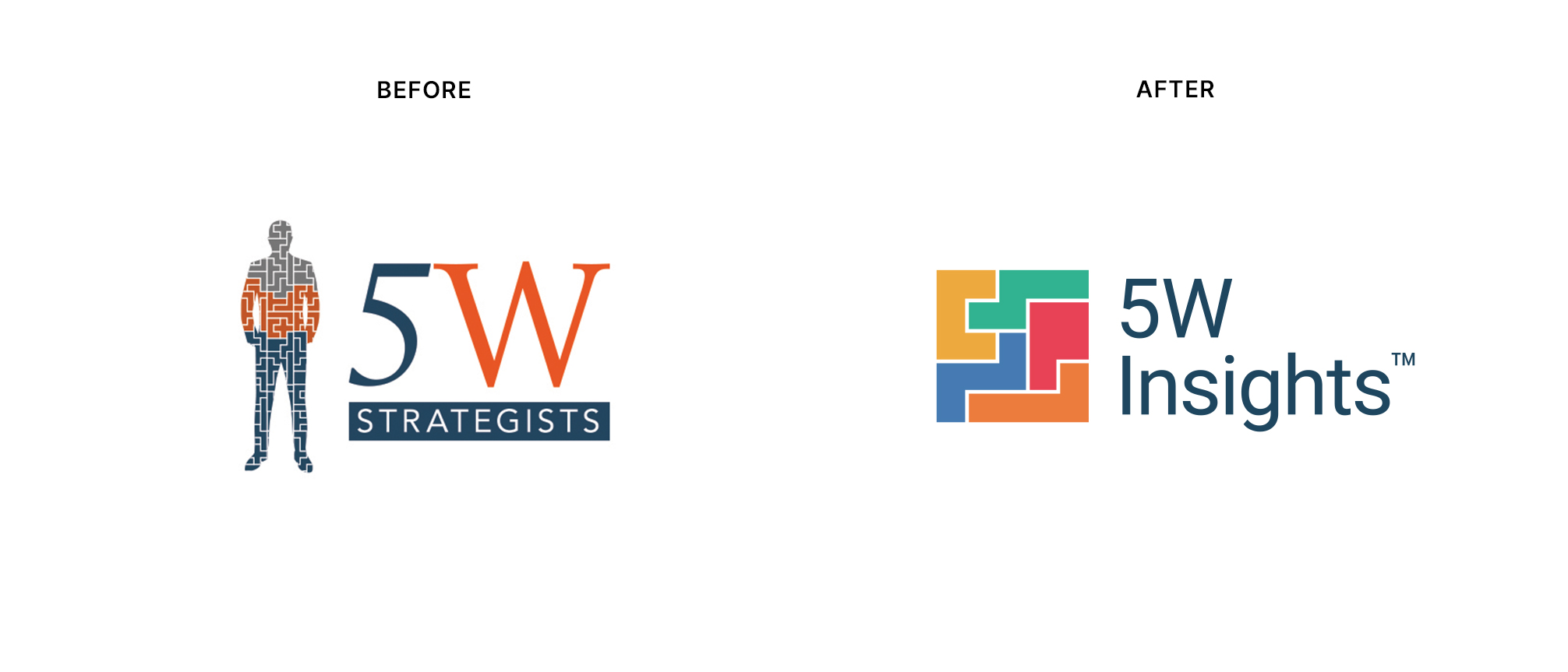
5W Insights
2022 • Brand Identity System & Internal Rollout
About: A B2B consultancy that helps direct marketers maximize revenue by optimizing the "5 W's" of engagement: Who, What, Where, When, and Why
The Refinement: To visually anchor the company's core value proposition, I leveraged a classic 5-piece pentomino puzzle. By strategically mapping each interlocking shape to one of their core "W" variables, this geometric solution transcended a simple logo. It became a functional, highly scalable visual language that the company now uses to map complex direct marketing variables and tactics across channels.
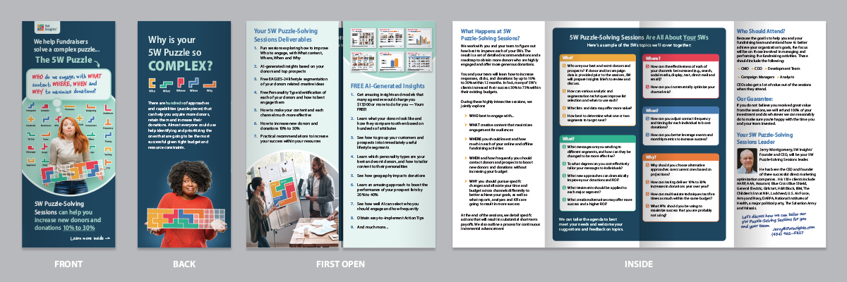
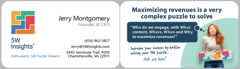
The Strategic Shift: Rooted in classic direct marketing, the company's legacy materials relied heavily on dense, long-form copy. My goal was to bridge the gap between their proven, messaging-first philosophy and the need for quick visual impact. Working closely with executive leadership, I leveraged the 5W puzzle system to transition our collateral into a highly scannable, engaging format that honored the company's depth of expertise while successfully competing for attention.
See more about how I implemented 5W’s new visual identity